Blunted
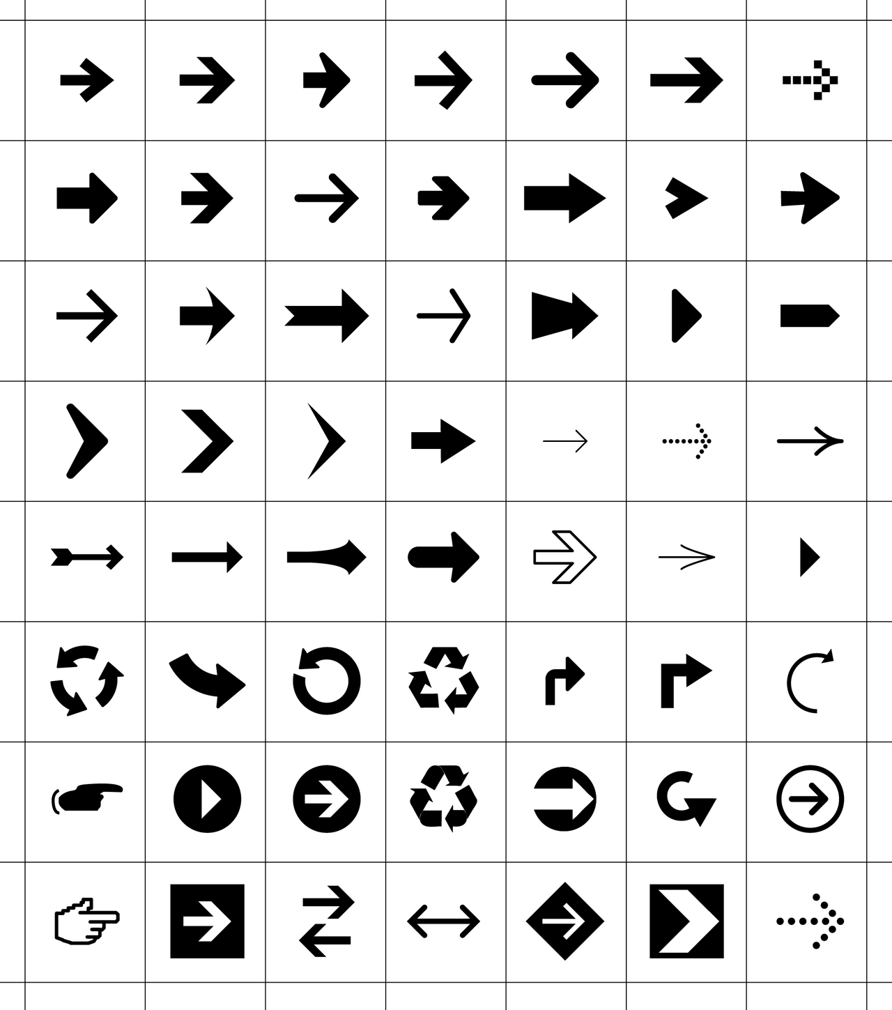
So when did arrows get so blunt? I remember how avant garde the 90-degree arrow-point seemed back in the 70's, but I'm pretty sure we relegated it to the “showy” end of the pool.
Today, I was looking for a way to indicate relative position in a stack of 3, and a search for arrow icons yielded page after page of stylish right-triangle capped arrows. How nice. But just as those safety scissors were inefficient at cutting, a blunt arrow is bad at pointing. Jeez people, forget your grousing about Apple's ruination of {some subset of }, we've clearly been adopting an “Arial Esthetic”: almost as pretty as the real thing, but nowhere near as good at getting the job done.
I think in our rush to tear down the other's heroes, we've applied our impoverished arguing skills and ripped ALL the experts down. Without critically thinking that there might be something to their expertise, we think that a 5 min wikipedia “mastery” of some part of the jargon makes us competent to decide that “their” expertise is fictional. (Dunning-Kruger Effect) So we go with whatever option is presented first/closest/loudest, and add our voice to the clamor proclaiming the virtues of this better, faster, cheaper option.
That might explain Arial-over-Helvetica, but why the blunted arrows?
I think that while the amateurs making the licensing decision that lead us to the triumph of Arial, they were also flexing their position on showy rather than pointy arrows. Hey, they LOOKED so cool and modren[sic]. After that, it was the gradual amplification of the tasteless, how MSWord is “just like desktop publishing.” After choosing the pretty over the gorgeous, we've eroded the stock to the point where today we have arrows that look nice, but are in no danger of pointing someone's eye out.